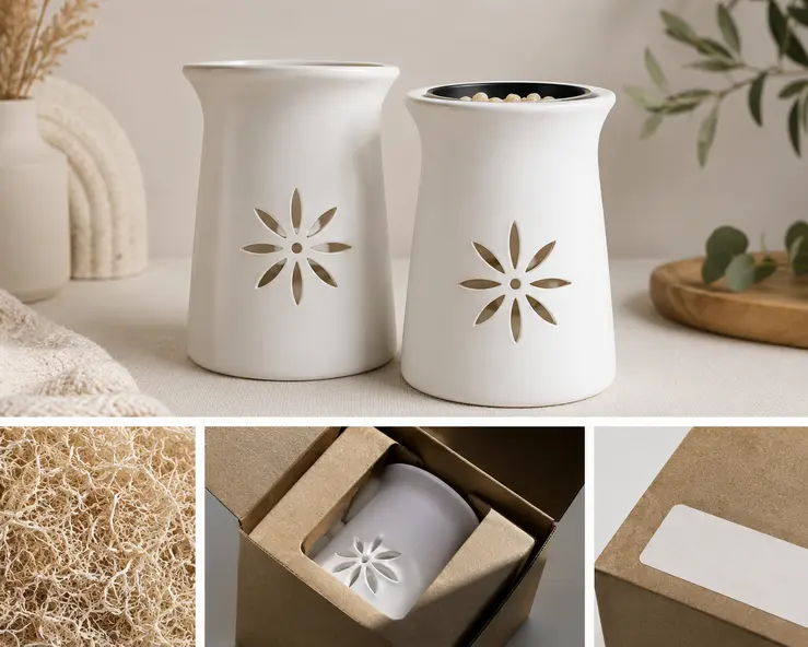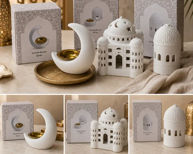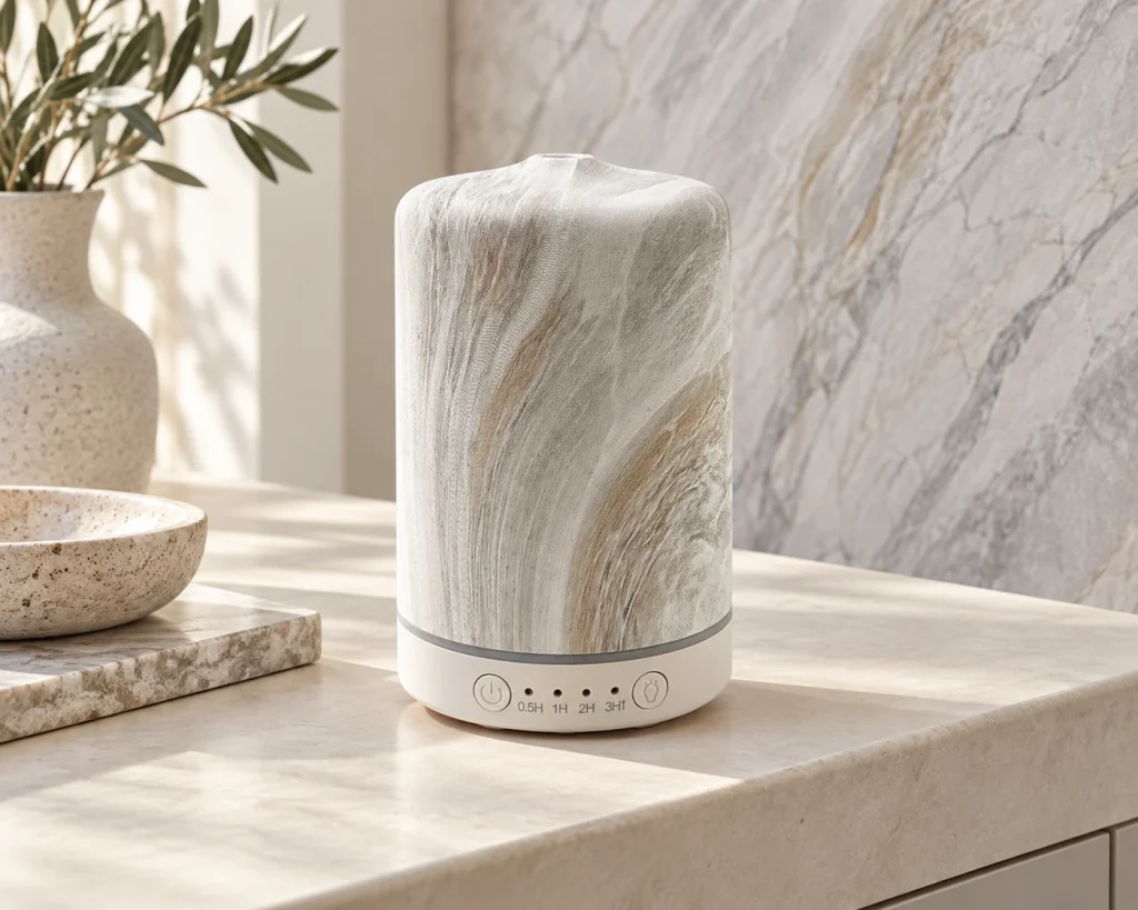
An interior design trend becomes useful to a fragrance brand when it can be translated into a product that fits the brand’s range, works for its intended use and can be produced with an agreed appearance. The starting point is to identify which part of the trend matters: its colour palette, material impression, surface pattern or shape. That decision helps determine whether an existing form needs a new finish or whether a new shape deserves development.
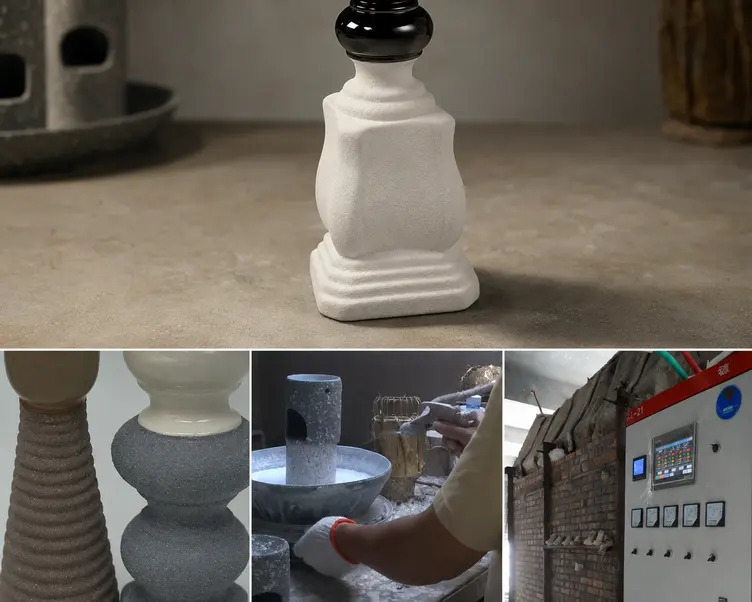
Green-Life’s experience with marble-effect products illustrates this process. The surface treatment connected with modern, simple interiors, particularly patterns seen on floor tiles and walls. Different patterns and colours were explored, but the final choice was classic grey and white. The useful lesson is the selection process: a broad visual reference was narrowed into a specific product direction. This example does not establish grey and white as the right choice for every brand or market.
Which Design Signals Belong in Your Product Range?
Interior design research can help brands see aroma wares as part of a room. Messe Frankfurt’s Ambiente Trends 27+, for example, discusses geometric structures, tactile materials and decorative fragrance products within its proposed style directions. These are design observations and sourcing inspiration, rather than evidence that a particular vessel will sell in a particular channel.[1]
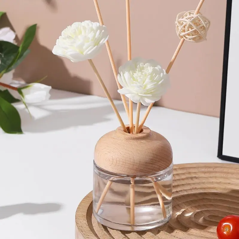
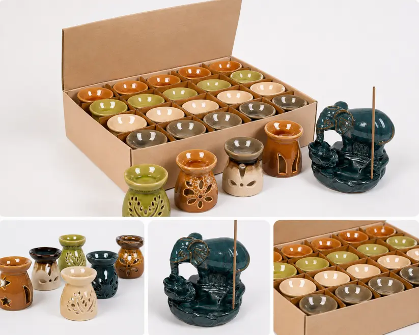
For a fragrance brand or retail buyer, the next question is where that visual direction belongs. A restrained finish might support a range intended to sit comfortably among existing furnishings. A more expressive form might suit a collection built around decorative statement pieces. Both are possible directions; the choice depends on the intended customer and the role of the product in the assortment.
For examples of how a home style can be expressed across aroma wares, explore Green-Life’s Home Style aroma collections.
Channels also affect how a product’s appearance is communicated. Online, photographs need to convey its pattern, proportions and surface character clearly. In a physical store, shoppers can also judge how it looks alongside other products and how it feels in the hand. A finish selected from an interior photograph therefore needs to be evaluated at the scale of the actual vessel and in its intended retail setting.
Before developing several versions, define whether the product is intended as a continuing range or a limited seasonal addition. A trend reference alone cannot establish how long demand will last. More committed development needs a clearer reason for the product to remain relevant beyond the initial visual interest.
Turn a Style Reference into Specific Design Choices
Words such as “modern,” “natural” or “luxurious” leave too much open to interpretation. A useful design brief separates the reference into features that can be discussed and compared: the base colour, strength of the pattern, surface sheen, silhouette and proportions.
For a marble-effect vessel, for example, the team can decide whether the central idea is a quiet grey-and-white palette, pronounced veining or contrast between a simple shape and an active surface. These are different design priorities. Identifying the essential feature gives the developer room to adjust less important details while keeping the intended character.
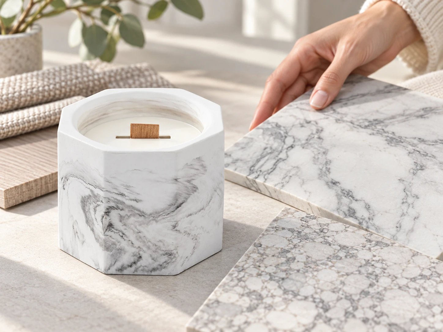
Green-Life has found that a product’s surface effect cannot always match the material effect of interior finishes or soft furnishings exactly. The reference may come from a different material, process or scale. The brief should therefore distinguish visual coordination from an exact material match. If a close visual match is essential, it needs to be evaluated using physical samples before committing to the wider collection.
A marble effect also describes an appearance; it does not by itself mean that the product is made from marble. Material descriptions should remain accurate even when the design draws on the look of another material.
When Is a New Finish Enough—and When Is a New Shape Needed?
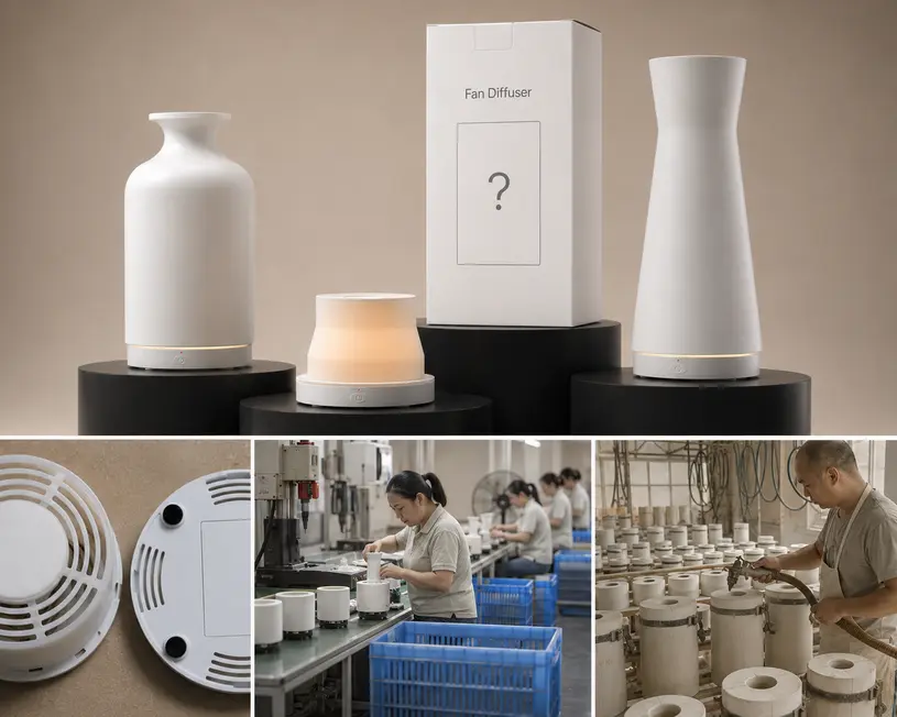
Green-Life’s development team first considers whether an existing shape, with a different surface effect, can achieve the appearance required by the new collection. When it can, the form offers a starting point for development. When the result falls short or requires too much compromise, the team considers whether a new mould and shape would better serve the collection.
This is a useful commercial test because it connects development spending to the visible result. Keeping an existing form has value when the finished product convincingly belongs in the proposed range. If the outline itself conflicts with the concept, changing the finish may leave the brand with a compromised design.
The reverse also matters: a new mould needs a reason beyond making the project new. If the recognisable character comes mainly from colour and pattern, a new shape may add work without contributing enough to the collection. If proportion or silhouette is essential to the concept, tooling may be more relevant to the intended differentiation.
Neither route establishes feasibility or a fixed saving. A finish change still needs assessment on the selected product. A new shape brings tooling, sampling and production questions whose cost and timing depend on the project. The decision is whether the additional development addresses a meaningful gap in the design.

Let Function Define the Available Design Space
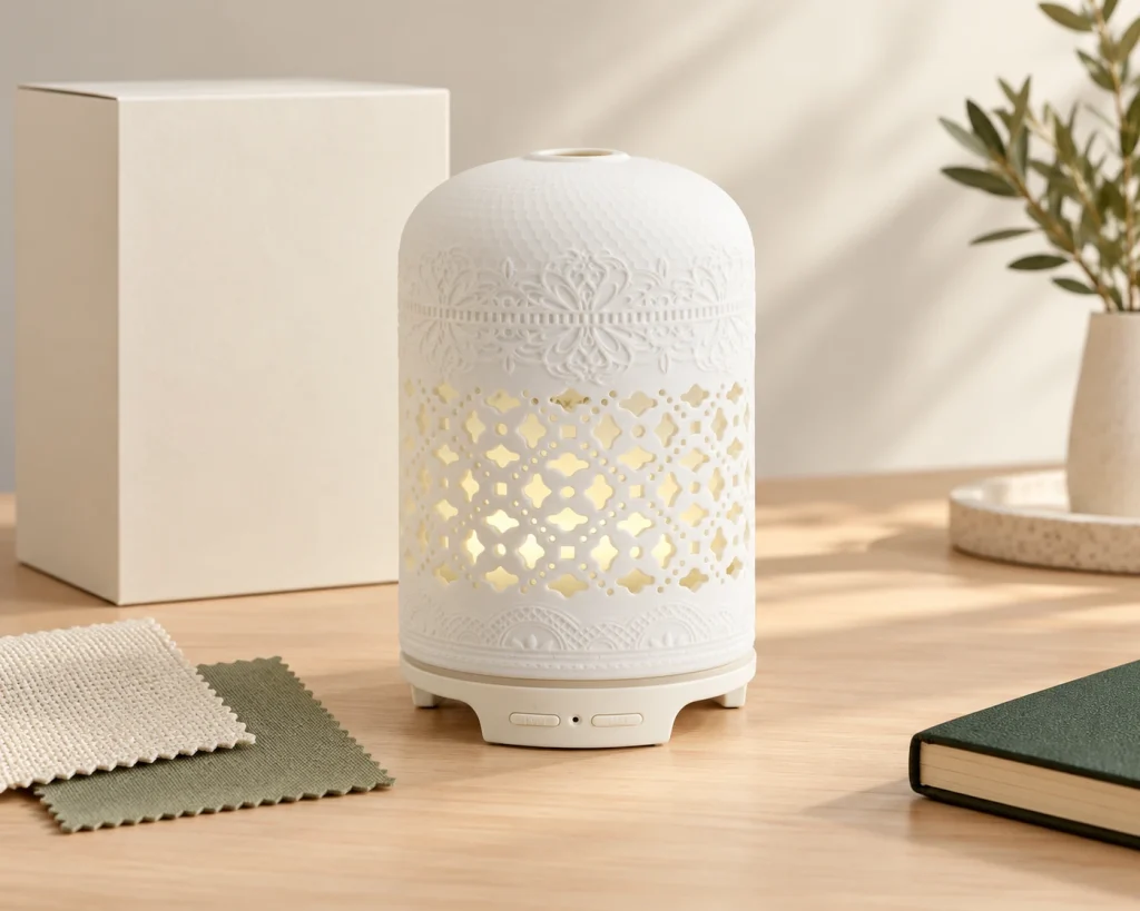
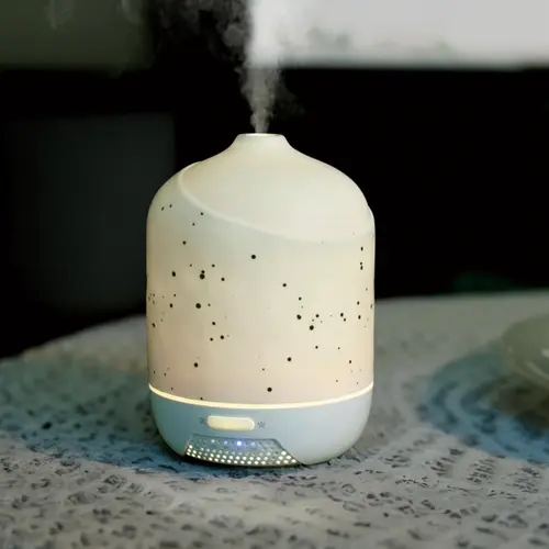
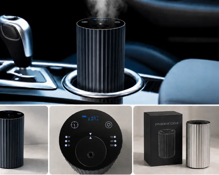
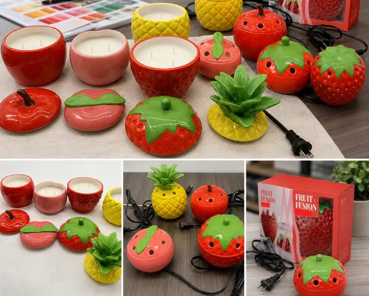
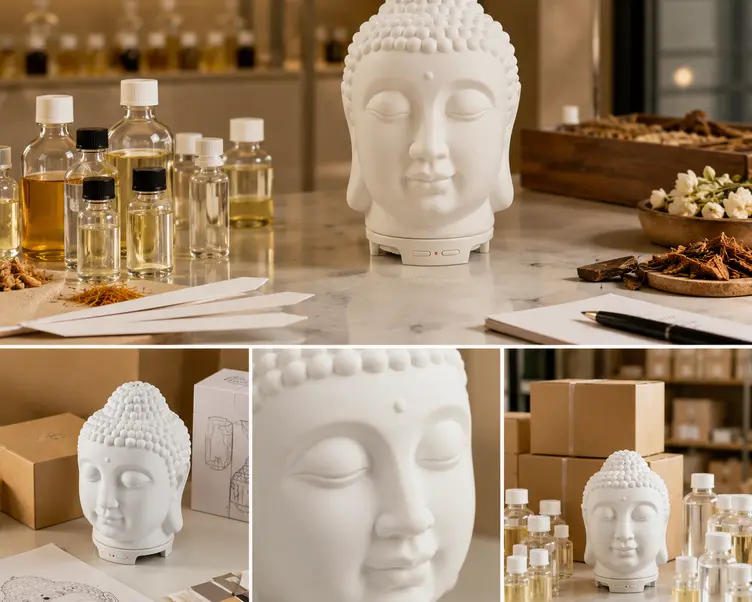
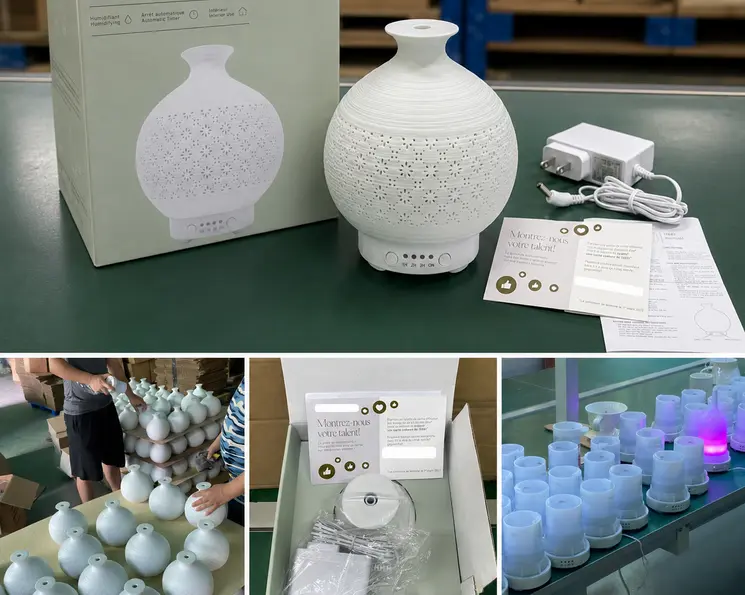
In Green-Life’s experience, the core components of some functional products limit the variety of shapes that can be developed. An electronic aroma product, for example, has to accommodate its working components. Its decorative appearance must be developed around the requirements of the complete product.
That can change where a trend is expressed. If the overall form has limited flexibility, colour, surface pattern or selected decorative details may carry more of the visual identity. If the concept depends on a substantially different silhouette, the team needs to assess the engineering and structural changes required before proceeding.
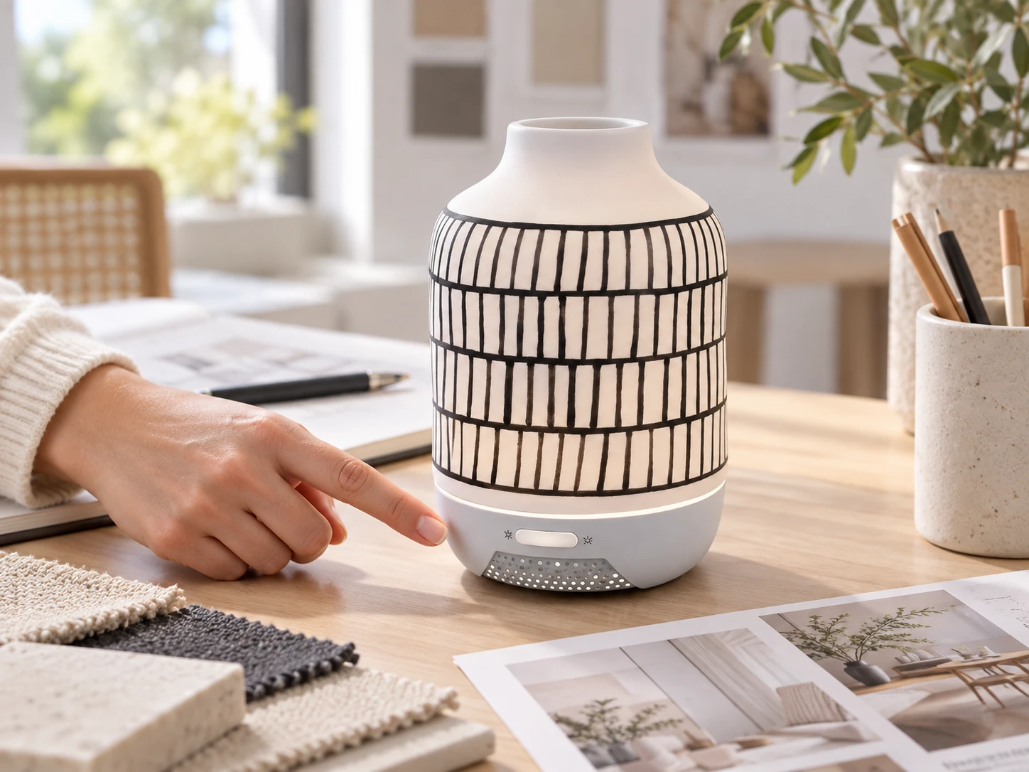
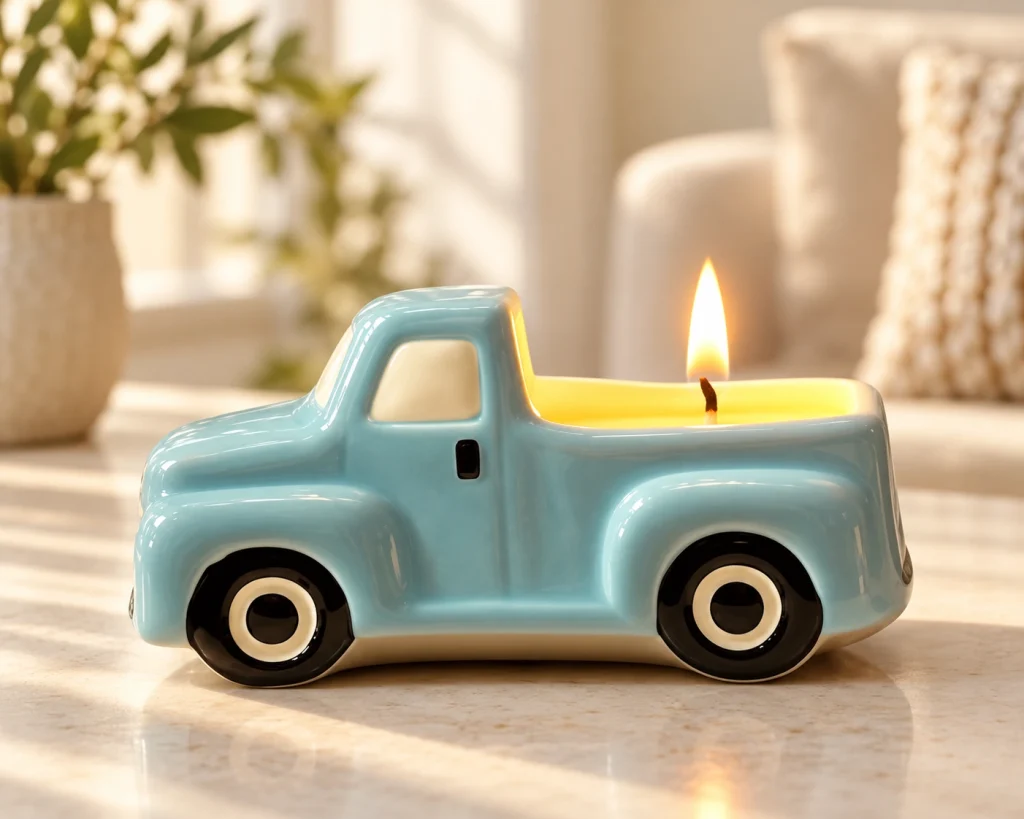
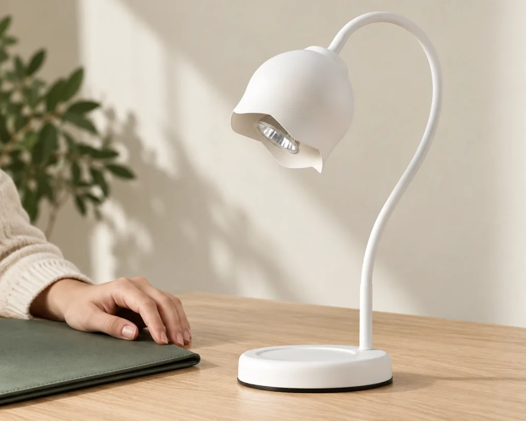
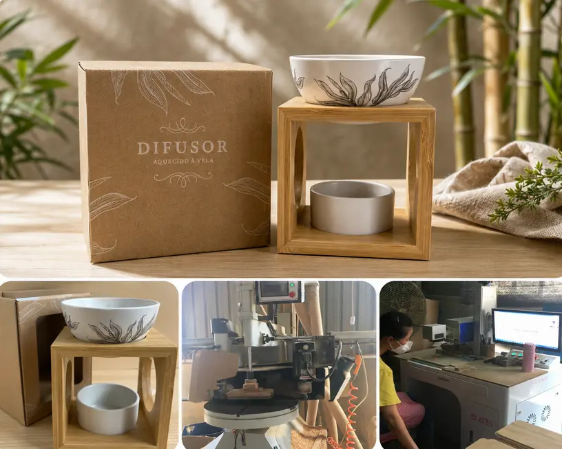
The relevant constraints also differ by use. A decorative diffuser vessel, candle container and powered fragrance device cannot be evaluated as interchangeable objects simply because they share a finish. Appearance decisions need to remain compatible with the intended fragrance format, handling and operation. Changes to shape or decoration may also affect packaging and require reassessment.
These constraints help define a realistic design opportunity. They do not show that the product is ready for production, and an attractive sample does not establish functional suitability.
Build a Coherent Range Before Adding More Variants
Exploring several colours and patterns can clarify a direction, as in the marble-effect example. It does not mean that every explored version should become a saleable item.
Each additional variant creates another combination to specify, present, order and hold in stock. Brands should ask whether it serves a distinct purpose in the collection or merely adds another option with a similar role. A smaller, clearly differentiated selection may be more manageable, although the appropriate range size depends on the channel and business model.
A common palette or surface language can connect different aroma wares without forcing them into the same shape. Functional differences may justify different proportions. The collection can still feel coordinated if its key visual features are deliberate and recognisable.
For seasonal concepts, consider whether the expressive element can sit on a form with a longer useful life. For a continuing range, consider whether future finishes can be introduced without weakening its identity. These are planning options, rather than guarantees of lower inventory or longer product life.
Use Samples to Decide Whether the Concept Deserves Further Investment
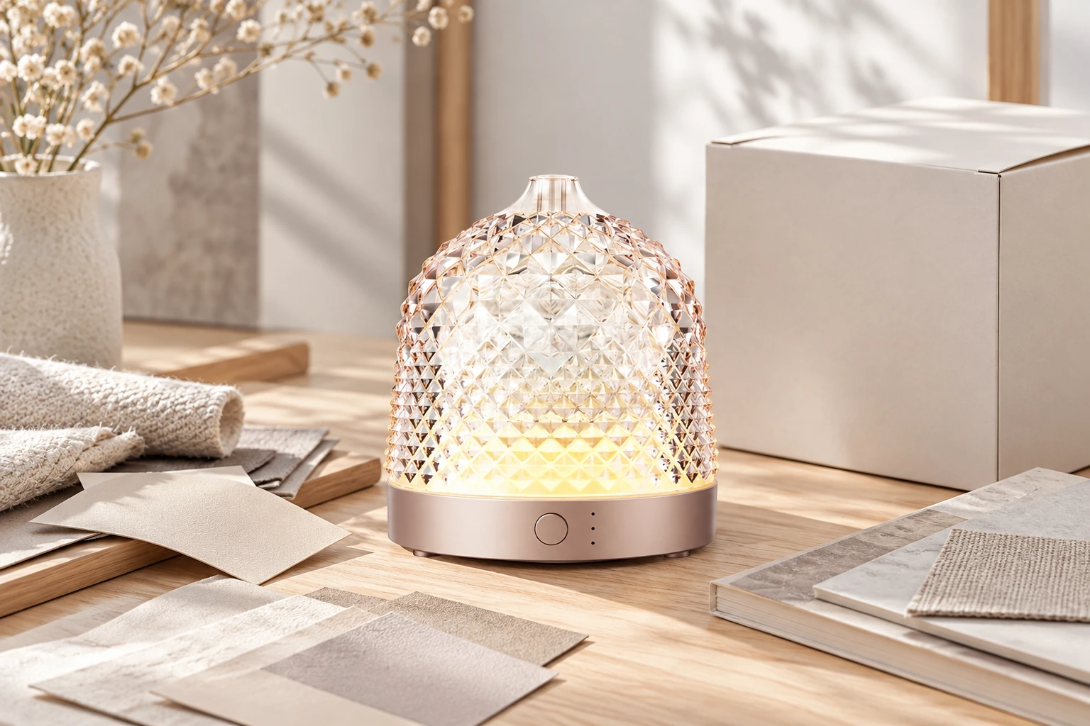
Sample review should establish whether the design has survived translation into a physical product. Does it retain the feature that made the reference relevant? Does the finish work on the actual shape? Can the product fulfil its intended use, and can the expected appearance be defined for production?
The answer may support proceeding, simplifying the surface treatment, reconsidering the form or stopping the concept. Cost, packaging and delivery conditions also need to be understood before committing to the range. One attractive sample cannot prove repeatable production or market demand.
The strongest outcome is a clear choice about where to invest: a finish that gives an existing form a convincing new role, or a new shape that delivers something the existing form cannot. The trend provides the starting reference; the product earns its place through its design, intended use and development conditions.
Sources
[1] Messe Frankfurt — Ambiente Trends 27+: Coexistence celebrates the energising power of coming together. https://ambiente.messefrankfurt.com/frankfurt/en/press/press-releases/ambiente/trends-27.html. Accessed 15 October 2026. ↩